Porsche logo, is it always looked the way you know it?
 Mónica Redondo @MonicaRedondoD
19 July 2023
3 min.
Discover the origins of the Porsche logo. Did you imagine it like this?
As you probably know, the shield or logo of the Stuttgart-based brand is one of the most famous in automotive history, and every detail in it carries great meaning. However, in the early 1960s it came under some criticism. In the Porsche Archive, some proposals that did not make the cut at the time are still preserved.
In 1948 this was all that was needed to define what we now see as a true icon. Legend has it that the original aluminium letters were made by an apprentice with a jigsaw, and they were designed to appear on the Porsche 356 “No. 1” Roadster that competed and won at the Hofgarten race in Innsbruck, Austria. Yet today we don’t recognise a Porsche by those letters, but by its famous crest.
Years later, in 1951, Dr. Ottomar Domnick took the initiative. He launched “The Porsche Prize“, a competition to define the logo that would represent the new brand. However, none of the proposals submitted met the requirements. Some time later, during a business dinner in New York at the end of 1951, Max Hoffman spoke with Ferry Porsche and revived the idea of designing an emblem. Following this conversation, the following note appeared in Ferry’s notebook, dated 27 December: “Steering wheel decorated with the word ‘Porsche’ and the Stuttgart coat of arms or similar.”
In 1952, the designer Franz Xaver Reimspieß, a talented draughtsman, created the decisive design: a rearing horse, taken from the coat of arms of the city of Stuttgart and set within the outline of a golden shield. These elements, together with the name Stuttgart at the top, clearly denoted a commitment to car production in Zuffenhausen. The red and black state colours surrounding it, as well as the antlers, are inherited from the traditional emblem of Württemberg-Hohenzollern, with the Porsche logo forming a protective arch over everything else.
Discover all the secrets of the Porsche crest
In collaboration with Hanns Lohrer, new sketches were created in the 1950s and 1960s. He was a professional who, like Erich Strenger, another important graphic designer of the era, left his mark on this era of Porsche.
Hanns Lohrer was entrusted with a very important task: to create a new crest. It was initially to be launched with the successor to the Porsche 356, a project known internally as “Programme T8”. But nothing came of that proposal.
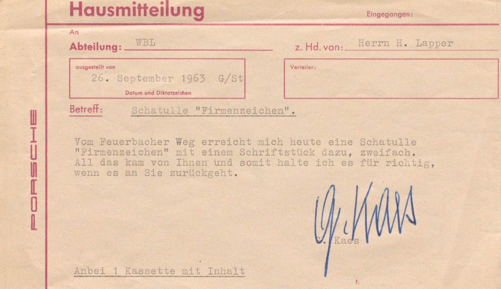
If we know of these drawings today, it is thanks to the correspondence of the secretary and chronicler of Porsche, Ghislain Kaes. Apart from these papers, no evidence of the efforts made at that time can be found in the Porsche Archive.
Presumably, the decision was taken that the logo in use since 1952 was already too well established to consider a change of direction in the design a good idea. Ferry Porsche put forward this argument once when Ottomar Domnick suggested to him that, with its horse, the Porsche crest looked too much like the logo of the coachbuilding company Reutter.


 Peugeot E-208 GTi: a battery-powered toy that revives the spirit of the 1980s sports cars
 New Lexus ES: luxury grows and goes electric
 First contact with the Dacia Sandero Hybrid 155: power and efficiency from €19,890
Deja un comentario